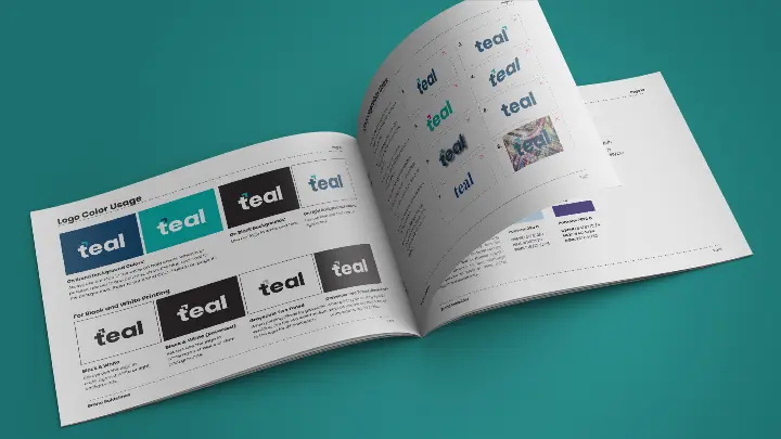
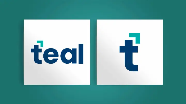
Teal, a managed IT service provider, approached Cubicle Fugitive to create a new logo, representative of the company’s new brand strategy and positioning. Understanding the significance of a logo, Teal was excited to work with our team to develop a logo that would become a crucial aspect of the brand’s identity.
Cubicle Fugitive’s goal was to design a logo that seamlessly represented the firm's past, present, and future while embodying modern and professional elements. Since Teal was a newly formed company resulting from a merger, we aimed to provide the client with a design that felt both familiar and subtly paid homage to their previous brand identities.
The new logo needed to encapsulate their brand values - sophisticated, persevering, altruistic, and transcendent. Emphasis was particularly placed on the altruistic aspect, which stems from the founders’ core belief in helping people, a driving force behind the creation of both original companies, and view their client’s success as their own. Additionally, sophistication was crucial to reflect the high-level work their clients entrusted them with.
Given the name "Teal," Cubicle Fugitive naturally incorporated the colour teal. However, defining the exact shade posed a challenge due to varying interpretations. We presented a range of teal shades along with complementary palettes featuring yellows, reds, greens, corals, purples, and blues. Ultimately, the company settled on a bold teal, a deep blue, a light blue, and a purple. The blue represented sophistication, trustworthiness, and reliability, crucial qualities for a managed IT service provider. The teal conveyed dependability and a sense of premium service.
The chosen logo incorporated several other key elements. Our team opted for the Poppins font, a contemporary serif font known for its minimalistic and clean design. The lowercase wordmark conveyed a genuine and approachable tone, aligning with their altruistic ethos. We also needed to create a complementary icon that would seamlessly integrate into the brand. The icon positioned atop the "T" subtly referenced the arrow from one of the original companies, symbolizing their unwavering support for their clients.
Creating the logo was a collaborative effort involving our strategy, design, and development teams, ensuring the logo would be practical from both a design and technology standpoint. The client was highly satisfied with our work and is pleased to have a logo to carry them into the future.


