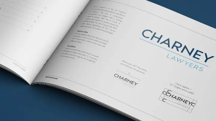
Charney Lawyers is a top tier litigation boutique firm that is committed to excellence in advocacy. The firm is meticulous, commanding, and strategic with a strong record for success.
The result is a simple and clean wordmark featuring the firm name in an uppercase font separated by a key line, which represents confidence and strength. With this in mind, Cubicle Fugitive worked with Charney Lawyers to design a wordmark that would accurately showcase the firm’s brand. The result is a simple and clean wordmark featuring the firm name in an uppercase font separated by a key line, which represents confidence and strength. The choice of brand colours also work to reinforce the firm’s values. The lighter blue brings a sense of approachability. In some collateral, crimson is featured as an accent colour to bring warmth and a contrasting element.
Once the wordmark was approved, Cubicle Fugitive worked with the firm to roll it out across refreshed collateral including business cards, letterhead, envelopes, e-signature, as well as a branded slide deck.

