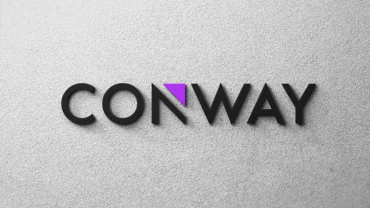
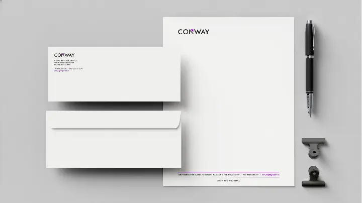
Following the brand strategy, we assisted with Conway to reimagine their logo. The first step was to establish the foundation for a strong brand and new visual identity that embodies the sharp and decisive litigation counsel and reputation established by the firm’s people.
The logo incorporates a subtle arrow which symbolizes how Conway shows their clients the “way”, with their forward-thinking and dynamic approach to the law, conveying the idea of pushing forward, and being the ones to forge the path. The typeface is Noir Pro. Noir is a sans serif font family with contemporary aesthetics heavily influenced by early 20th century geometric typefaces. While having its geometric structure it carries an organic personality with a touch of warmth injected into each form.
The dramatic and pronounced angles represent the sharp and precise nature of the lawyers at Conway. Together, the design elements create a logo which is both bold and progressive while still carrying with it an air of prestige and timelessness.


