In 2022, PACE Technical and Vertex Solutions teamed up to start a new MSP venture. Their goal was to disrupt and reinvent the client experience in the Managed Services IT sector. They believed in doing things differently and created a unique business model that puts employees and clients at the center of everything they do. Their focus was on creating an exceptional client and employee experience from start to finish.
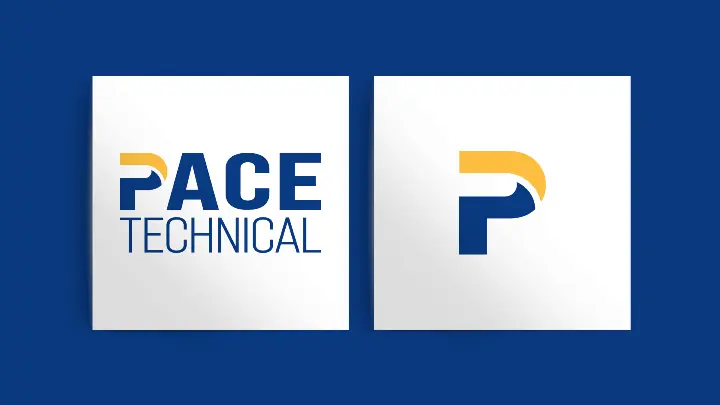
With this new venture came the need to rebrand and better reflect their core values and client promise. PACE Technical and Vertex Solutions worked with Cubicle Fugitive to design a logo that embodied their merger of equals. The distinct P used across all their applications ensured easy identification of their services. Vertex Solutions brought a clean, modern brand and a trustworthy colour palette. We worked to create a logo that tells the story of their two companies coming together to solidify their service promise. The P symbolizes Vertex and PACE’s roots and their unwavering dedication to propelling their clients’ and teams’ success.
We worked to create a logo that tells the story of their two companies coming together to solidify their service promise.Vertex’s vibrant blue and yellow were chosen to go with PACE’s name. A few additional secondary pop colours were added for visual interest. The PACE scribble was included in the brand for personality and to emphasize key content with its distinct yellow colour. It is used exclusively in major headings to accentuate specific keywords or direct attention.
Both parties loved the new brand so much that they included a sneak peek at the evolution of their brand in all internal and external merger communications.

