Case Study
Robson Carpenter LLP
Robson Carpenter LLP is a condominium and subdivision development law firm located in Ayr, Ontario and serving the Kitchener-Waterloo area and beyond. Robson Carpenter is the go-to firm for condominium and development law, and they have built a reputation for excellence.
The Challenge
Robson Carpenter came to us for help with their brand image and strategy. While the firm had built a reputation for great work and excellence in their field, their website and overall brand did not reflect that level of excellence. They needed a game plan.
In addition, the firm had begun to build a young team of exceptional talent and had recently named two new partners, making a step towards building the succession and future of the firm. Craig Robson and Greg Carpenter laid the foundation for the firm and spearheaded their journey to success, however they knew that they could not lead the firm forever. With fresh talent preparing to take lead roles and a solid reputation in place, the team knew it was time to signal a change and create a new brand that would help to support and build the profiles of future leaders.
.tmb-cfthumb_m.webp?Culture=en&sfvrsn=8e9230d8_7)
The Engagement
We started the process by getting to know Robson Carpenter on a deeper level. We spoke to their entire team of lawyers as well as administrative staff and law clerks. We did a deep dive into their current materials and conducted a thorough audit of their website, service offerings, and their competitors. Once this research was complete, we were able to identify the firm’s unique value proposition.
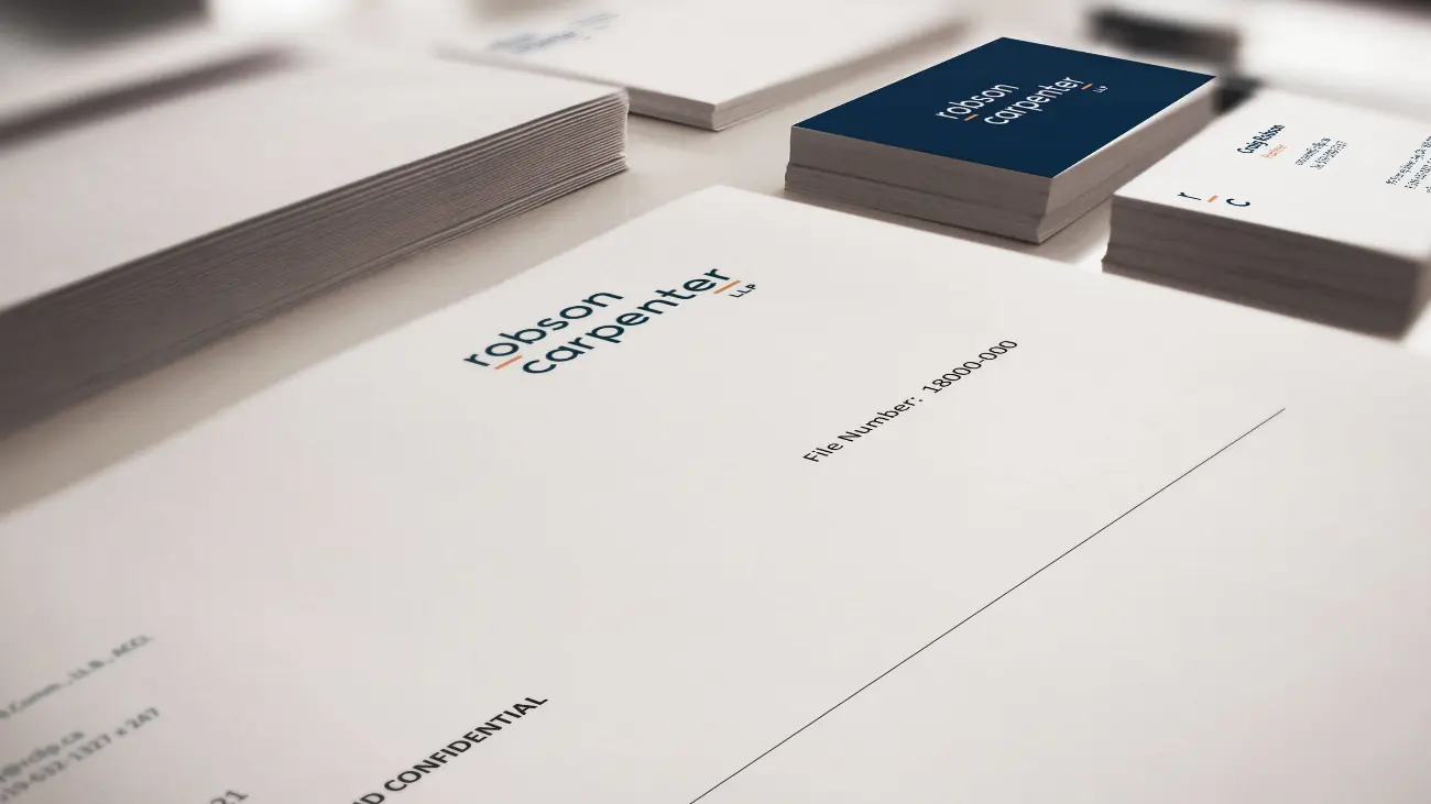
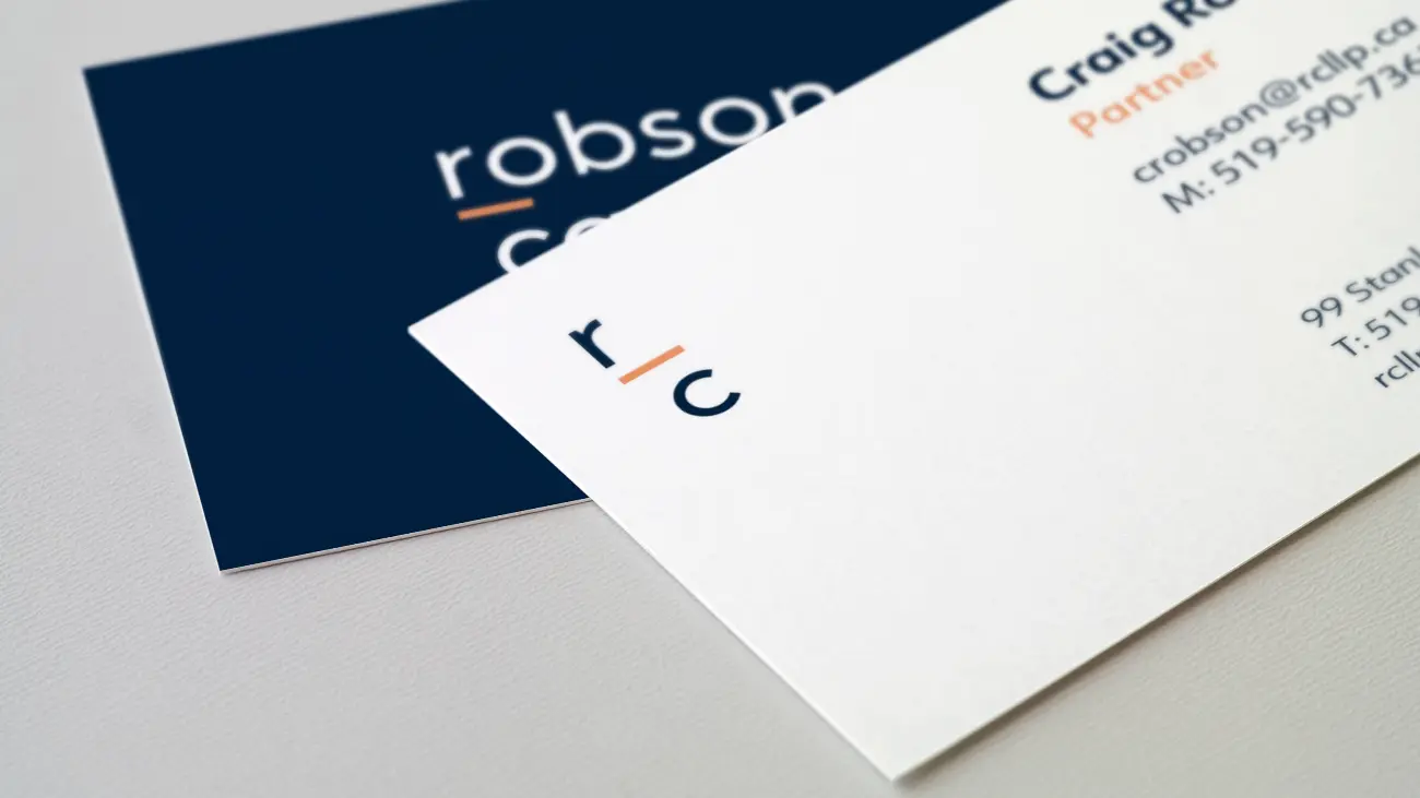
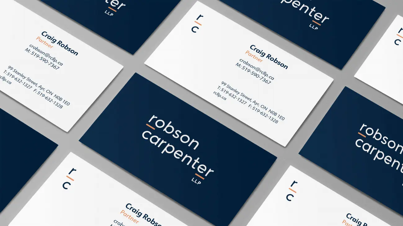
Once a strategy was devised, we developed headlines and messaging to market the new brand. From there, a visual brand was conceived. Our designers worked with our strategy team to develop a new logo, new colour palette, and new visual brand, that would signal a new era for the firm and that would clearly represent the firm’s unique brand positioning. With a new logo then came new business cards, letterhead, envelopes, and more.
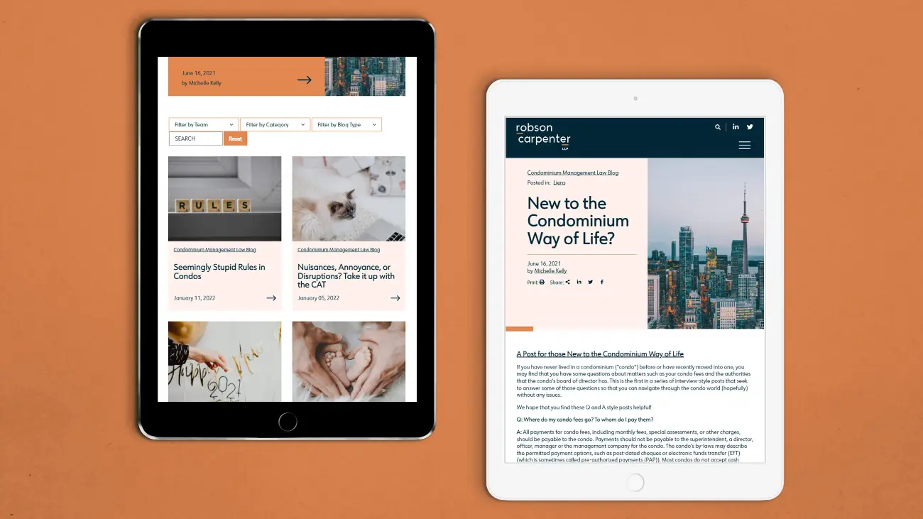
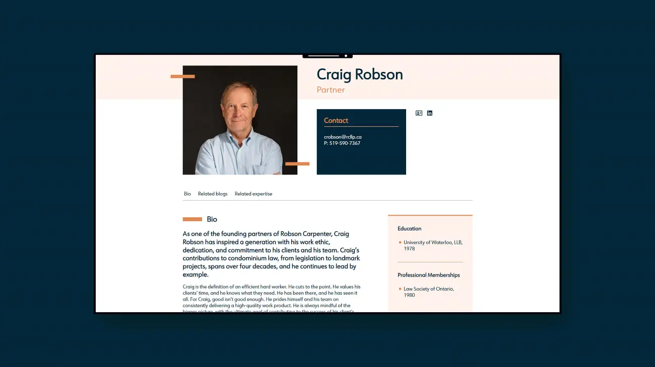
Lastly, we worked together to design and develop a new website for the firm along with new content. The new website aimed to simplify the user experience, welcome a user with open arms, and better reflect the premium nature of the legal services the firm provides.
.tmb-cfthumb_m.webp?Culture=en&sfvrsn=a42ce436_7)
.tmb-cfthumb_m.webp?Culture=en&sfvrsn=93846874_7)
.tmb-cfthumb_m.webp?Culture=en&sfvrsn=d2242076_7)
.tmb-cfthumb_m.webp?Culture=en&sfvrsn=823c7e6_7)
The Strategy
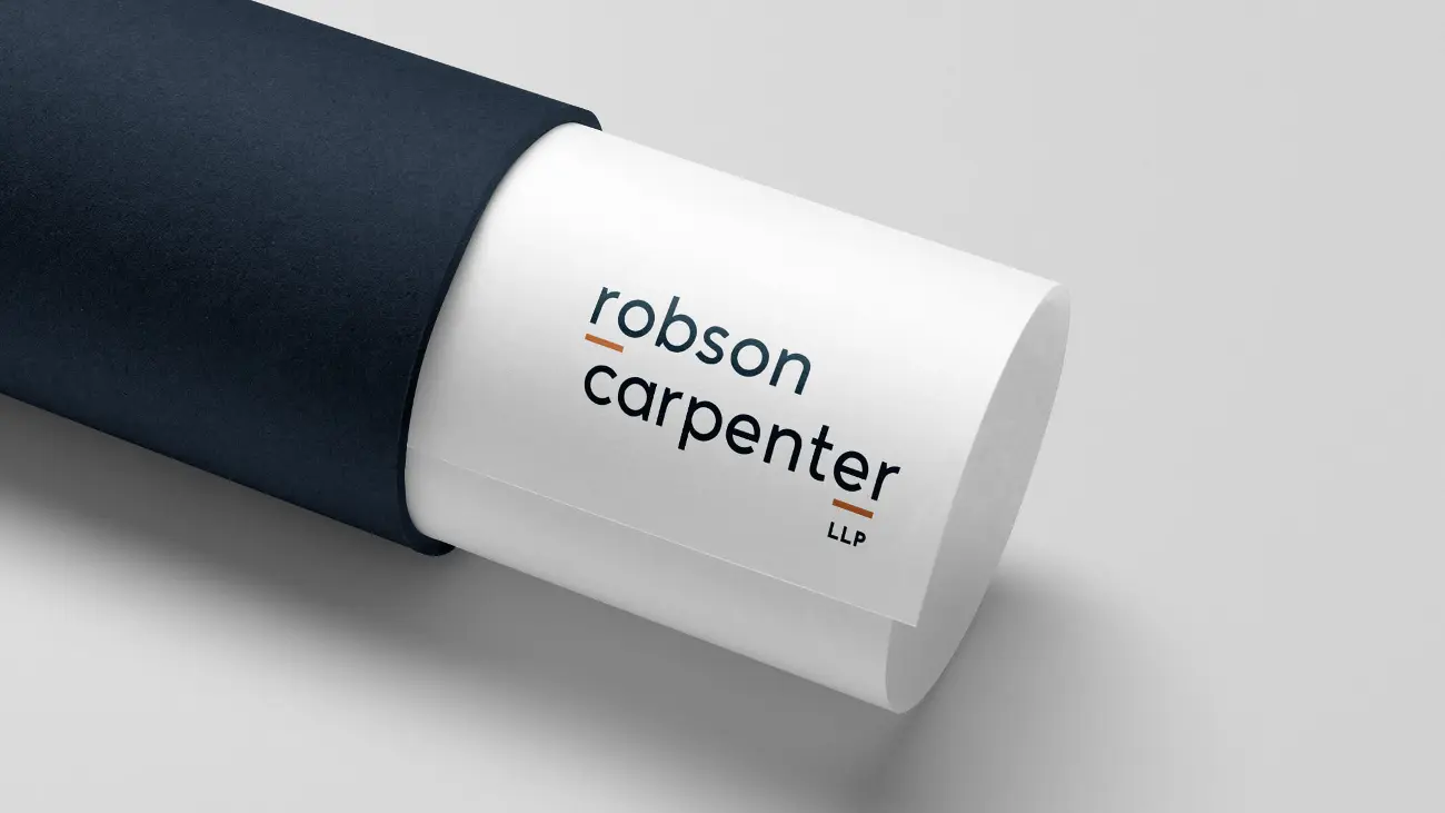
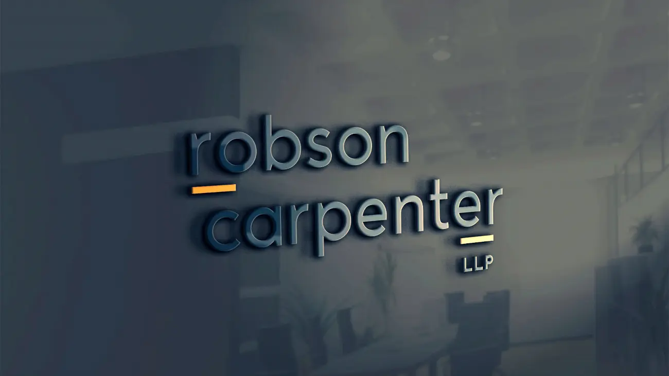
Upon gaining a deep understanding of the firm, who they are, and where they are headed, we were compelled to design a modern, clean, and unique logo. The original firm logo was not completely dated, but it did not capture the essence of Robson Carpenter, and its icon (a tri-rectangle symbol for buildings) was lackluster. We captured the firm’s visual brand by way of a fresh, unique, and standout colour palette, paired with a simplified and unique logo in all lowercase fonts, with the use of simple dash iconography to emphasize the initials of the founding partners. We also created various uses and a simple icon to be used for business cards, and other small format printing.
For the firm’s new website, we knew it needed to be clean, simple, functional, and straightforward. Our design team ensured that all colours and fonts were AODA compliant and that all visual brand elements used, were aligned with the brand strategy. With this website we wanted to find a balance between a simplified user experience and providing a user with all the information they need, whether they are a potential client, an existing client, an internal stakeholder, or a recruit. We wanted to ensure that the navigation was simple, easy to use, and easy to navigate. We wanted to ensure that the user knew exactly what this firm specializes in, upon landing on the home page. Lastly, we wanted to ensure that we spoke to a user in plain language, without legal jargon and without any fluff – a common characteristic of the firm’s lawyers.
As part of our engagement, we interviewed the team and crafted new bios for all of the firm’s lawyers. It was important that the bios were written with a consistent tone of voice, and with elements of the brand strategy infused into the content. Along with the bios, Cubicle Fugitive also crafted the firm’s new content that would be showcased on some of the key pages on the website such as the Home Page, Who We Are, Join Us, and all headlines used throughout the site
.tmb-cfthumb_m.webp?Culture=en&sfvrsn=d44dc10b_7)
The Results

Related Expertise
-
-
-
-
-
-
06
Web Design & Development
Form and function—websites that clients, marketers, and IT will love.
→ -
-
08
Website Development
Build your website on best-in-class technology customized for professional service firms.
→
Related Sectors
-
Law Firms
Specialty Practice→
